Data Visualization with ChatGPT#
ChatGPT and other Large Language Models (LLMs) can help create compelling data visualizations by:
- Finding and analyzing datasets
- Generating visualization code
- Improving visual design
- Creating data stories
Watch this workshop (2h) on creating data visualizations with ChatGPT
Prerequisites#
To follow this tutorial, you’ll need:
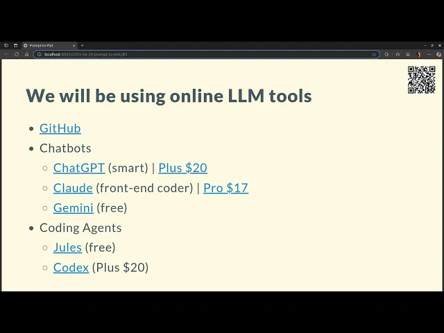
- Gemini (free) - good for processing images and video
- A ChatGPT Plus subscription ($20/month) - recommended for access to advanced models and coding capabilities
- GitHub account - for publishing visualizations
- Basic familiarity with HTML/CSS/JavaScript
Other useful but optional tools include:
- Claude ($17/month) - particularly good at front-end code
- Command line tools:
Finding Datasets#
When asking ChatGPT to recommend datasets, provide clear requirements:
- Size constraints (e.g., “around 10,000-100,000 rows”)
- Desired column types (text, numbers, categories)
- Target audience and story potential
- Any specific themes or domains of interest
Example prompt:
I need an interesting dataset for data visualization that:
- Has 10,000-100,000 rows
- Includes various column types (text, numbers, categories)
- Could tell an engaging story for a general audience
- Ideally covers [your preferred theme/domain]

Please search online and suggest datasets matching these criteria.
Ideating Stories#
Once you have a dataset, ask ChatGPT to suggest story ideas:
Given these columns in my dataset:
[List your columns]

Please suggest:
1. A dozen potential data stories
2. Target audience for each story
3. Why each story would be interesting
4. Initial approach for analysis
Analysis and Visualization#
For the analysis phase, instruct ChatGPT to:
- Run statistical tests
- Filter out insignificant results
- Create aesthetically pleasing visualizations
- Consider outlier handling
Example prompt:
Please analyze this dataset by:
1. Running relevant statistical tests
2. Removing statistically insignificant results
3. Creating beautiful visualizations (consider styling, colors, typography)
4. Handling outliers appropriately
5. Ensuring the visualization tells a clear story
Generating Web-Ready Code#
When creating visualizations for web deployment, provide specific constraints:
Please create an HTML/JavaScript visualization that:
1. Works well on GitHub Pages
2. Keeps the data payload under 2MB
3. Handles outliers appropriately
4. Uses modern JavaScript
5. Follows good web performance practices
Improving Visual Design#
To enhance the visualization’s appearance, ask for specific improvements:
Please improve this visualization by:
1. Using a professional typography system
2. Implementing an appropriate color scheme
3. Adding proper spacing and layout
4. Including clear annotations and context
5. Making it feel like a professional publication (e.g., New York Times style)
Example Projects#
Here are some examples of data visualizations created using this approach:
- Books Visualization
- Books Analysis
- LLM Data Visualization
- Books Visual Story
- Books Data Exploration
- Coffee Reviews
- Story Visualization
Best Practices#
Iterate with the LLM: Don’t expect perfect results on the first try. Refine your prompts based on the outputs.
Be Specific: Clearly specify your requirements for:
- Visual style
- Performance constraints
- Target audience
- Story elements
Data Size: Consider GitHub Pages limitations when deploying. Either:
- Preprocess data to reduce size
- Use data sampling techniques
- Implement progressive loading
Code Quality: Request modern, maintainable code:
- Use ES modules
- Implement responsive design
- Follow web accessibility guidelines
- Include error handling
Documentation: Ask the LLM to include:
- Clear code comments
- Setup instructions
- Data preprocessing steps
- Deployment guide