Data Aggregation in Excel#
You’ll learn data aggregation and visualization techniques in Excel, covering:
- Data Cleanup: Remove empty columns and rows with missing values.
- Creating Excel Tables: Convert raw data into tables for easier manipulation and formula application.
- Date Manipulation: Extract week, month, and year from date columns using Excel functions (WEEKNUM, TEXT).
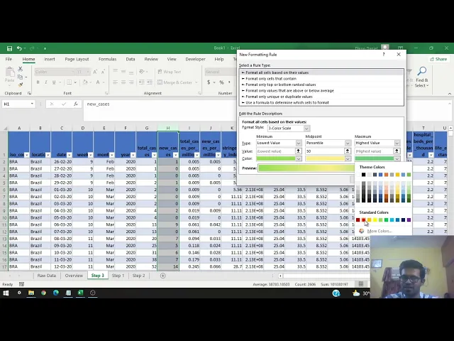
- Color Scales: Apply color scales to visualize clusters and trends in data over time.
- Pivot Tables: Create pivot tables to aggregate data by location and date, summarizing values weekly and monthly.
- Sparklines: Use sparklines to visualize trends within pivot tables, making data patterns more apparent.
- Data Bars: Implement data bars for graphical illustrations of numerical columns, showing trends and waves.
Here are links used in the video: