Data Storytelling#
Transcript#
Once you’ve analyzed your data and put it together into charts, you still want to communicate it in a way that people will remember, that people will share. And that’s where storytelling comes in. What we’re going to look at in this module are ways of telling stories.
There are many ways in which you can narrate a story, and one way is just to show the numbers. This in itself can be powerful. What you see here, for example, is a correlation matrix which has conditional formatting on Excel that will help you understand how two securities are correlated. And it’s pretty easy to see that, for example, the Pakistani rupee is negatively correlated with many of the securities. Just the numbers can give people an understanding of what’s happening behind the scenes and convey a story.
Another way to narrate the story is through visuals, typically charts. On this chart, for example, you can see that for the last three months, starting from August to September to October, till 31st of October, the number of COVID cases is steadily declining. And the chart itself, the visual itself, tells the story.
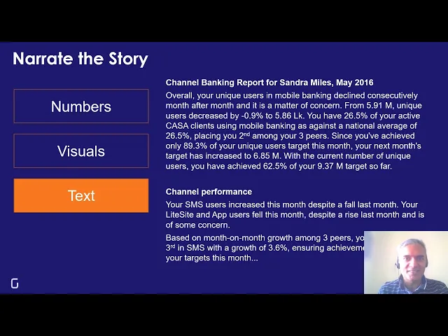
A third way of narrating a story is through text, where we just use words to communicate what data is telling us. For example, this is a report in plain text, telling Sandra Miles, who is a channel banking manager, how the number of users has performed across different channels, how it’s doing against competition, how it’s doing against the last month’s performance, what its gap is against the target, and so on.
In fact, this is perhaps the most common way in which people narrate stories—through text, more than through numbers and through visuals.
Yet another way of narrating stories is through illustrations. You’re all familiar with comic books. Comic stories are how most of us started getting into fiction. This too can be applied to data. This visual is a comic story that talks about what went wrong at Tonga, where 90% of the Tongans are obese or overweight. And it takes data and communicates it as a comic story.
These mechanisms of storytelling are not mutually exclusive. It’s possible for you to combine all of these into a single story. For example, this story talks about China’s deep pockets. And it uses text clearly in the form of the dialogue between these two characters, as well as the titles. It uses the numbers to indicate what’s happening. It uses a chart, it uses illustrations, it uses comics, and through all of these mechanisms, we get a feel for what’s happening.
In this module, what you’ll be learning are tools that will help you create stories from data, using not just numbers and visuals, which have been covered in the earlier modules, but also using text and illustrations. This is a nascent area. This is an area where most technology does not really support you as well as it would for numbers and visuals. But it’s an exciting new field, and I believe that the bulk of communication of data is actually going to be through data storytelling, using text and illustrations as strong support to numbers and visuals.