Data Visualization with Seaborn#
Seaborn is a data visualization library for Python. It’s based on Matplotlib but a bit easier to use, and a bit prettier.
This video tutorial provides a comprehensive guide to Seaborn, a powerful data visualization library built on Matplotlib. You’ll learn how to:
- Understand Seaborn’s core purpose: It’s a data visualization library built on Matplotlib that simplifies plotting, often creating complex plots with just one line of code.
- Install and set up Seaborn: Learn how to install it using
piporconda, and how to import necessary libraries like NumPy, Pandas, and Matplotlib for seamless integration. - Load and manage data: Primarily use Seaborn’s built-in datasets (e.g.,
car_crashes,tips,flights,iris,attention) for practice, and understand how to load other file types via Pandas. - Create various distribution plots:
- Distribution plots (
displot): Visualize univariate distributions (distributions of a single variable), including histograms and Kernel Density Estimation (KDE) plots, and learn to definebins. - Joint plots (
jointplot): Compare two distributions by default as a scatter plot, and generate regression lines or show KDE or hexagon distributions. - KDE plots (
kdeplot): Create standalone plots for kernel density estimations. - Pair plots (
pairplot): Plot relationships across all numerical values in a DataFrame, showing histograms on the diagonal and scatter plots elsewhere. - Rug plots (
rugplot): Visualize single column data points as sticks, indicating where data is denser.
- Distribution plots (
- Master various categorical plots:
- Bar plots (
barplot): Analyze distributions of categorical data against numerical data, understanding variance bars and how to change the aggregation estimator (e.g.,median,std,cov) using NumPy functions. - Count plots (
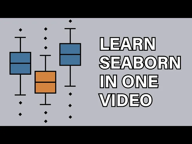
countplot): Simply count the number of occurrences for categorical variables. - Box plots (
boxplot): Compare variables by showing quartiles, median, standard deviation, whiskers, and outliers. - Violin plots (
violinplot): A combination of box plots and KDE plots, visualizing the density estimation of data points and how tosplitthem for comparison. - Strip plots (
stripplot): Draw scatter plots with one categorical variable, often used with box plots, and learn to usejitterto spread points anddodgeto separate categories. - Swarm plots (
swarmplot): Similar to strip plots but adjusts points to prevent overlap, often layered on top of violin plots.
- Bar plots (
- Generate matrix plots for correlation and data patterns:
- Heat maps (
heatmap): Visualize data in a matrix format, requiring data to be prepared using correlation matrices (.corr()) or pivot tables (.pivot_table()), and how to addannotations. - Cluster maps (
clustermap): Create hierarchically clustered heat maps that calculate distances and reposition data to find specific patterns and clusters.
- Heat maps (
- Utilize powerful grid systems for complex visualizations:
- Pair grids (
PairGrid): Gain specific control over plot placement within a grid, allowing you to map different plot types (e.g., scatter, histogram, KDE) to the upper, lower, or diagonal sections. - Facet grids (
FacetGrid): Print multiple plots in a grid, defining columns and rows based on categorical data, and apply various styling options to individual subplots.
- Pair grids (
- Create and customize regression plots:
- Regression plots (
lmplot): Study relationships between numerical variables, customize markers, sizes, and colors, and separate data into columns or rows based on other variables for multi-faceted analysis.
- Regression plots (
- Apply extensive styling and customization options:
- Set overall plot styles (
sns.set_style) likewhite,darkgrid,whitegrid,dark, andticks. - Adjust plot size (
plt.figure(figsize=...)). - Change plot context (
sns.set_context) for different uses:paper(Jupyter),talk(presentation),poster. - Control font scale (
font_scale). - Manage axis visibility by turning
spineson or off. - Change plot color schemes using
palettesand exploring Matplotlib’scolor maps. - Reposition plot legends for better readability.
- Customize marker symbols, sizes, line widths, and edge colors in various plot types.
- Set overall plot styles (