RAWgraphs#
You’ll learn about RAWGraphs and how to create data visualizations, covering:
- Understanding RAWGraphs: Learn that RAWGraphs is an open-source data visualization tool designed to simplify the visualization of complex data for everyone.
- Data Import: Discover how to import your dataset into RAWGraphs by copying and pasting it from any spreadsheet application.
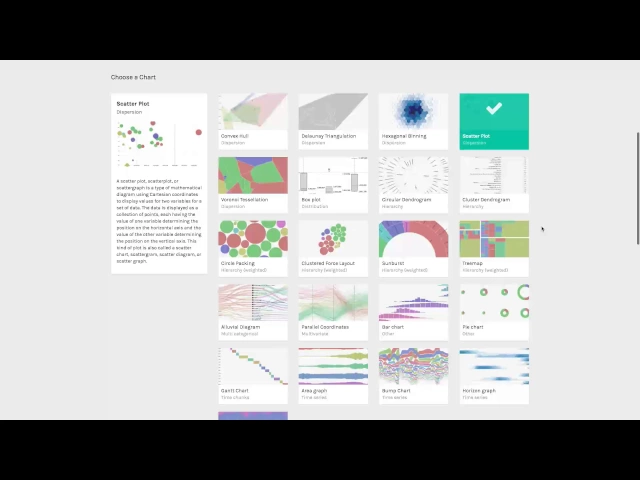
- Chart Selection: Understand how to choose from a variety of charts that are built on top of d3js, such as a scatter plot, suitable for your data.
- Chart Creation: Create different kinds of charts, notably non-traditional charts that go beyond bars, lines, pie, etc.
- Mapping Data Dimensions: Learn the process of mapping your dataset’s dimensions to the visual variables of your chosen chart. This includes examples like mapping rating to the horizontal axis, production budget to the vertical axis, box office to bubble areas, genre to color, and movie names to labels.
- Customization and Export: Find out how to customize your visualization and export it as a vector or raster image, which can then be fine-tuned using any graphic editor.
- Further Resources: Be informed about where to find more information on RAWGraphs’ website and how to contribute to the project through GitHub.
Watch these videos to learn how to create non-traditional data visualizations with RawGraphs.